Throughout history, humans have a tendency to repeat themselves: sometimes out of habit, ignorance, or lack of a better way. But sometimes it comes from a place of empathy – to rediscover a vehicle for connection. Be it divine inspiration, or that primal need for reciprocity, sometimes the art of recreation can hold a magical place for setting the stage for a new-found authenticity.
CONVERSATION.13
Kenn, where was your love for illuminated manuscripts born?
K: My first introduction to illuminated manuscripts was from studying art history. I realize now I didn’t absorb everything about them. The course was very intense and very heavy informationally. It was old-school lecture. The art historian would get up and go through one slide after the next, and we were just scrambling to keep up with notes. And then you had to cull through a couple hundred slides down to twenty for an exam. So, it was tough.
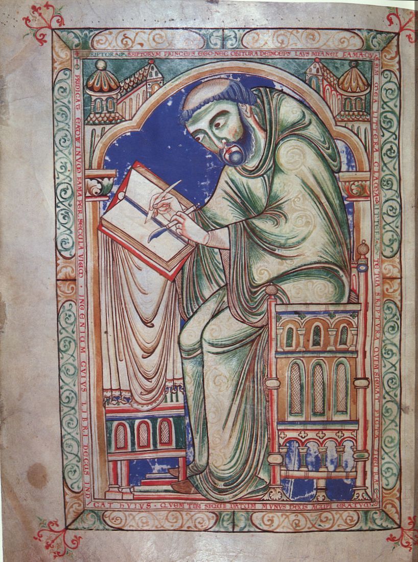
The next phase of that came when I left architecture and went into graphic design and began studying book design and book publishing. While taking a course on the history of graphic design, we learned about Gutenberg, of course, but then went back to the Medieval era where monks in monasteries would make these hand drawn, hand printed books.
I just saw them for their aesthetic purpose. It wasn’t about the belief system. I thought compositionally with that marriage of image and text they were really exquisite. And, of course, at that time in the mid-80s everything we were doing was hand drawn. So anytime we as a designer wanted to create over-sized type, we had to draw it out. That’s when that connection really began to solidify.
Moving into grad school, my first year, I worked for an art historian. I was often charged with photographing slides for his classes, along with other professors. There was one professor, Phoebe Allen, from the architecture department who was tough as nails – some of her comments, maybe true, made some students cry. But she was smart as a whip. She brought this book to me that she wanted photographed into slides. It was the Book of Hours, made for a more personal, devotional use by the Limbourg Brothers.
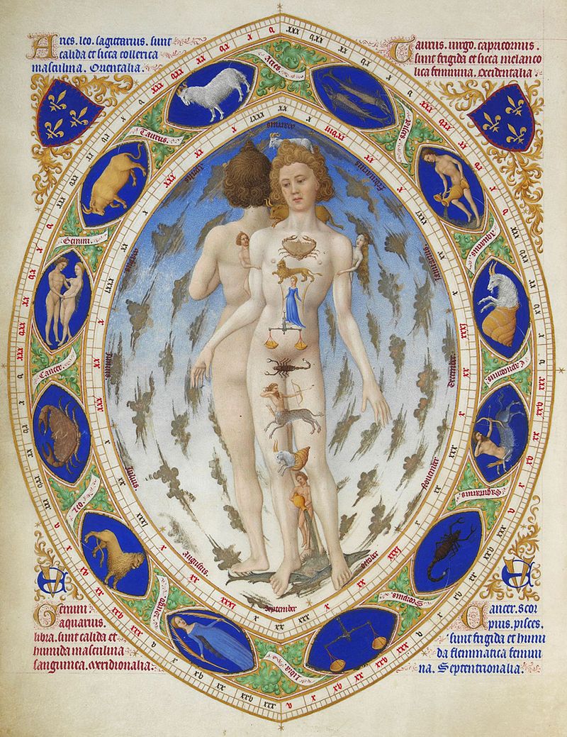
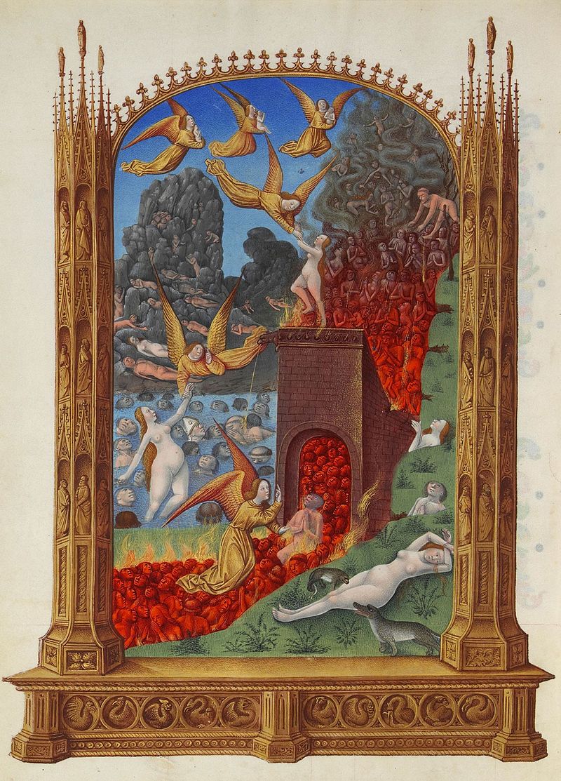
Trés Riches Heures du Doc de Berry
1412-1416, made for patron Duke of Berry by the Limbourg Brothers
K: The Book of Hours was a continuity of those illuminated manuscripts, made for the Duke of Berry for his own, devotional use. They are beautifully drawn, and gorgeously bound. When the illuminated manuscripts were made, the heads of religious sects, primarily the Christian church, were overseeing the making of them. But as the medieval period progressed, court patronage like the Duke began to commission small-scale devotional books that they could possess. These books dove-tailed the move from illiteracy to literacy.
Before then, no one had the need to learn how to read. Up until that point, everything transmitted orally. The manuscripts began a huge paradigm shift from vocal communication to written communication. And, the spread of information, right?
So, as I was photographing, I got to spend time with these books. What Phoebe Allen was using them for was her color study. They were so rich in color. The hues and saturation of them, with bright blues paralleled with golds and silver. That’s when I truly became hooked.

Louisiana Watermelon Festival, 1991, print on paper
K: And from that came one of my first poster designs. I created it for a watermelon festival. I incorporated Celtic knots, utilizing their complexity of interweaving elements into a theme. I’ve always been fascinated by these books, but of course, I moved on from this aesthetic over time.
And now I am returning to the idea, the notion of the manuscripts. I think it’s quite apropos, that with technology, fewer people read printed books. I’m one of those that can not read for very long on a computer. I like to hold that book in my hand. So the printed word is really important to me.
I also find it apropos that we are going through a phase right now where books are being censored because of their content. And so, the book has a really interesting history. After the illuminated manuscripts, Gutenberg is of course cited with being one of the first to start the mass production of printed books. But others quickly followed, so the literacy rate began to increase. With this, people began to become more knowledgeable about many different subjects.
The manuscripts themselves began to wane, almost disappear. You didn’t need them anymore. You didn’t need the monks in the private rooms, hunkering down, hand-drawing these books by candlelight.
Yes, that is the exact image I have as you have been speaking about these. I have only studied them a small bit, I can see the drawings of people hovering over these books, and the bright colors they used. They make an impression on you.
K: Oh, absolutely! And the neat thing about the original manuscripts is that they were produced on animal hides. The skins were so thin, like vellum. They would take the skins from cow, sheep and goat and scrape them down until they were translucent, like a milky white.
Because they used skins instead of porous paper made from pulp, is that how the color was so vibrant?
K: Yes.
And, what were they using: inks?
K: Inks, dyes, and gold leaf, silver leaf, … whatever was available to them. There is a huge conservatorship on maintaining these documents fifteen hundred years later. But there is evidence – some people kept documentation and data on how they were making these. There are centers like the Metropolitan, the Getty Museum, the National Gallery of Art, and the Bibliotheque in Paris that are the big hotbeds that possess a large number of manuscripts.
Have you seen any?
K: Yes, but, they aren’t exhibited often because they are so sensitive to light. This brings up another point about my pieces is that I want to bring them out from the dark ages, the Medieval times.
Literally and figuratively!
K: Right! Because the literacy rate was so low then, even if you could see the illuminated manuscripts in Medieval times, most could not read them.
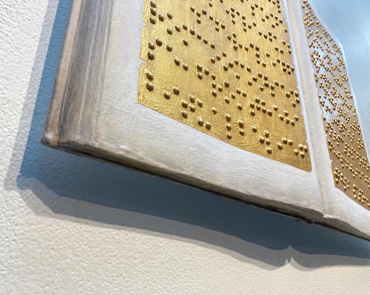
Ah, which most people will have when they view your illuminated manuscripts: they are in Braille.
K: Exactly. It’s codified to do just that. I’m seeing all these parallels. Of course, theirs are all drawn on the flat, two-dimensional surface, while the Braille in mine is raised off of the page. But I am using metallic paints and materials, which once again, captures the illumination. The illumination for them was derived from a connection to God. I think I am fascinated by that, but that is not the reason I am doing it. We view gold and silver far differently than they did in the Medieval period.
The notion of translation and decoding is very important to me, because now we can decode it. And, with current technology, there are even apps that will instantly decode Braille when you point your phone at it. There are so many interesting forces involved that connect and don’t connect that I am fascinated by. It has led to endless discovery.
Your show, “the deepest soundings” is coming up in Ruston, LA. When you observe people coming to your shows when you use Braille, how do they interact with it? What questions do they ask?
K: People are always interested as to what it is, what it means, and of course, they want to touch it. Depending on where the work is exhibited, and how it is exhibited, they are either allowed to touch, or officially can not touch. It gets into a whole liability and legality issue. I have to lock the pieces down, because it depends on who is touching them. If a child, say, were to push up to try to reach a piece, it could fall off and they are quite heavy. Someone could get hurt. So, I have to be very vigilant about this – it becomes “public art.” I have to consider “pinch points” and “harm,” and so on.
I want people to come into a gallery or museum and touch the artwork, feel the surface, but also gain an understanding deeper than the superficial level. So what I often do now is have a sheet of paper with the Braille alphabet. One of the first questions I often hear is, “What does it say?” And I will say, “Here you go, have at it,” and hand them a decoder sheet.
I’m always curious to see who is up to the challenge of deciphering it. I challenge them sometimes too. One piece, the word “silence” is repeated over and over. To take it a step further, I debossed the Braille dots instead of making them raised, so even a blind person could not read what it says.
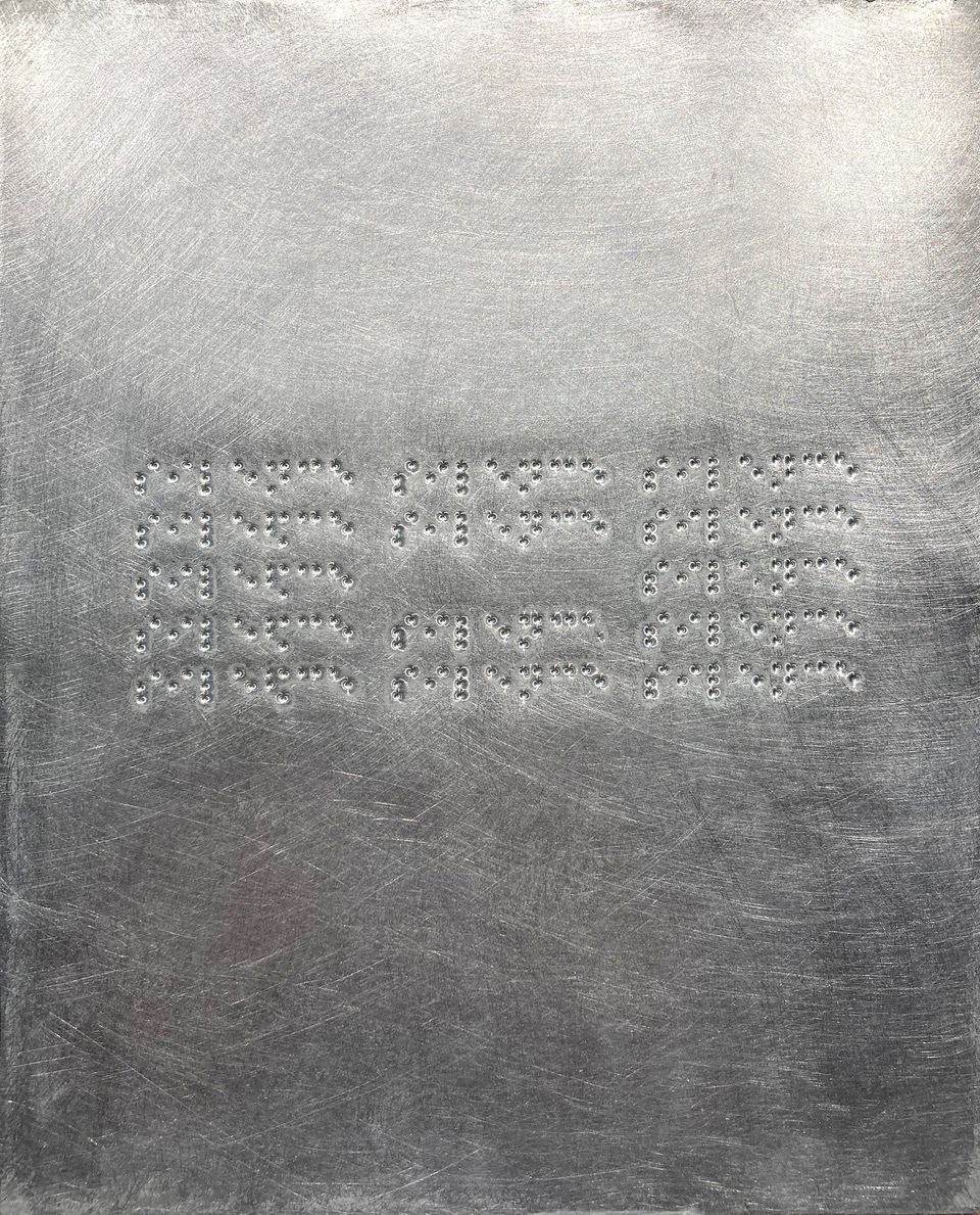
_i_e__e.02
2022, braille on brushed aluminum, 10×8 (transcribed from Eugen Gomringer poem “silencio”)
K: In this 21st century, we swim within codes. Telephones, television sets, military, … it goes on and on. People often speak in code. They don’t want their information to be heard or discernible to others. So part of what I am doing is challenging people – and myself – to question: What is information? When should we be able to gain the knowledge of that information? We now know our government and corporations are so much about secretive, clandestine, private information. And, do we need to know everything? No, we don’t. But, I think it would be good if we were informed with better information.
Back when the monks were writing and also translating these texts, weren’t they censoring what was put into the books? A question that arises is, ‘Who has hold of “the truth?’”
K: I’m glad you brought up this point. It’s why I am creating these Braille pieces. If a person isn’t willing to decipher it themselves, then they have to rely on me. And that gets into the whole idea of, “Do we believe our leaders? Can we trust our leaders?” And, I’m talking about leaders of all kinds, whether it’s government, religion, corporations, sometimes even your own best friends. How can we know if they are telling us the truth? Not to be on the dark side of this, but the skeptic in me realizes that whomever is in power, holds the structure to that power. They hold the dissemination of that information. And as you are saying, could it be that we change a word or phrase because it better suits our agenda?
Then you have to think about translation: from latin to greek to french, and so on.
It’s kind of like the game of “telephone,” where, by the time a word or phrase has been whispered down the line, it has a whole new meaning.
K: That idea of translation, and that repetition of information. Through that process, it has to get lost. Part of that is probably being lost because of Paleography (the study of ancient texts and scripts). For someone in the 21st century to study latin, how difficult must that be? From the earliest symbols of text to now: how right are we getting it?
To me, it involves histories, all forms of communication, all forms of structural power and agenda: these are embedded pretty much in every piece that I do. It just opened up this new realm when I began punching Braille. It’s all about code: those from long ago to new codes becoming evermore complex.
But, getting back to the books themselves. The books of course were created for the missionaries who would go out to spread the word. And, once again, if a person can’t read, they see this beautiful book, the missionary tells them, “This is what it says, and you must convert to this,” who is holding the key to the information? How much does the recipient want to believe in that? But it truly allowed for the spread of Christianity throughout Europe. Some of the biggest producers of the manuscripts: France, Italy, the UK … the Lindesfarne Gospels produced in Scotland. It’s just truly amazing that they still exist.
And, imagine the missionaries transporting these books. How did they keep them clean and dry?
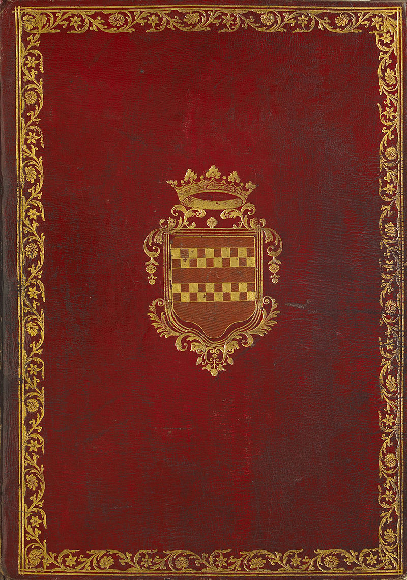
K: Well, and sometimes now all we see are the pages that have been torn out. But some books still exist with the hardback covers. They had clasps and locks. Some of them were so fancy and ornate they would even sit within a box themselves.
How have you created your illuminated manuscripts?
K: I find books at used bookstores and repurpose them.
So, you are up-cycling. Do you become attracted to a book because of its size, content, or both?
K: It’s less about content, and more about its size and material with which it is made. Hardback for sure. I prefer uncoated interior paper because it will accept paint far better. So now what I am looking at is size. I like the very large books, but I also love the very small, almost palm-held, miniature books. Some of these books have thousands of pages. I have been building up the surfaces of these, but now I am wondering, what if I started digging into the surface as well? Digging into the content of those particular books. What if I allow the content to drive the composition?

iM365.01.nc.avl
plinth for former Vance Monument, downtown Asheville
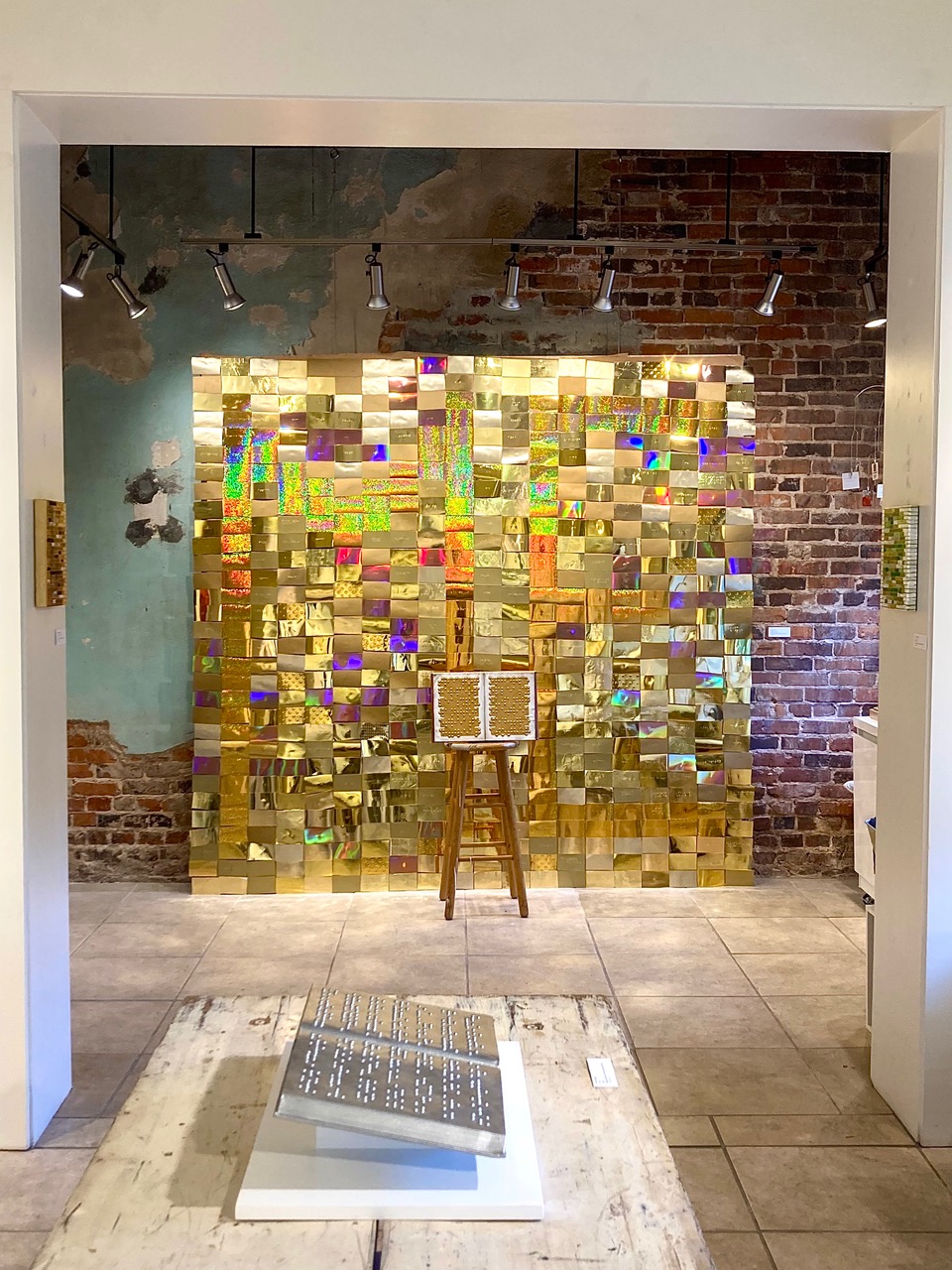
iM365.009.la.rtn
Ruston, LA at Fringe: An Art Experience with installation of “believe me: me” (background) and iM.fr (foreground)
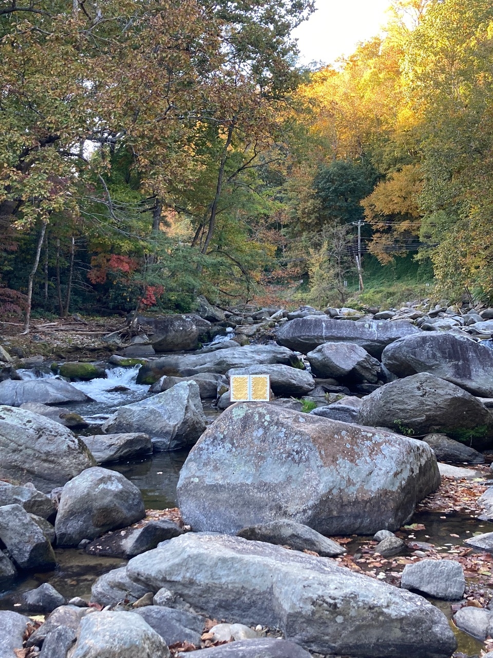
iM365.009.nc.crk
(10/14/22) – Broad River below Chimney Rock State Park, NC
K: There are so many different approaches. These first books are more on the simpler side. But, with the iM365 which is my daily, traveling book, it’s get a little more complicated. I have been thinking more about the patterning of the image that sits on the surface of this book, so it is moving more toward complexity.
I have noticed the beautiful patterns at the ends of the lines of Braille on the iM365 piece. Is that an historical reference, or what purpose do they serve?
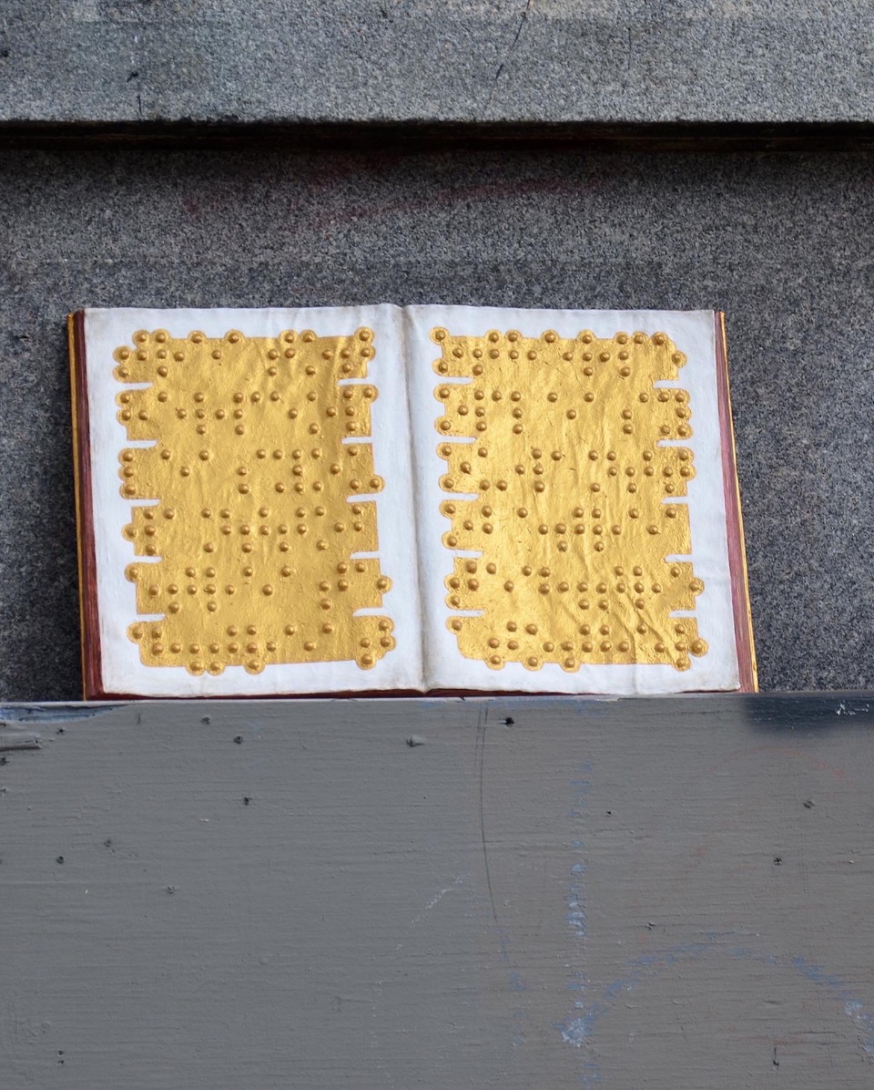
iM365.001.nc.avl (detail)
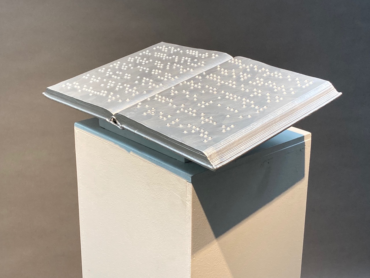
iMfr
2022, furniture nails & acrylic on repurposed book, 5x19x12
iM.tinbr (detail)
2022,
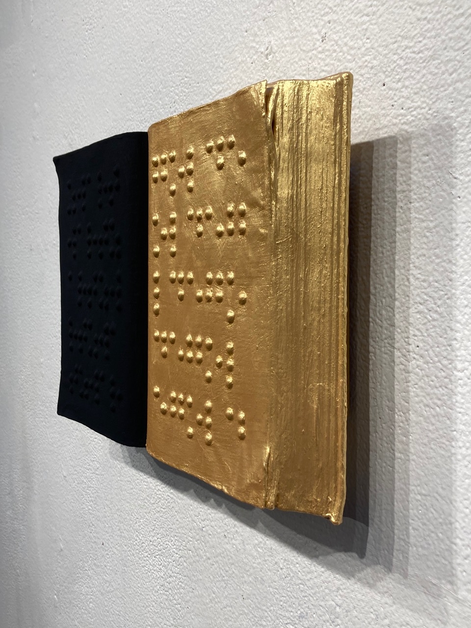
iM.zg (side view)
2022, furniture nails & acrylic on repurposed book, 8.25×13
K: I wanted to incorporate way-finding elements for sighted people. Aesthetically, they are also an embellishment. After the “the deepest soundings” show in Ruston [see the end of this conversation for details], I am looking forward to getting back in the studio to dive deeper into the complexity that I really appreciate about the older, original manuscripts. What that means, I’m not quite sure. It depends on a number of factors.
An image just popped into my mind of you, hovering over a table, creating these, just like the monks once did.
K: A lot of my work is so time-consuming like the monks. It has an almost obsessive-compulsive quality, where I sit in a stationary place barely moving, building up layers of this minutiae. I do spend a lot of time with my nose to the grind stone. At times, I do have to stop, stand up, stretch {laughs} and see what the work looks like from a distance. I also have to consider, of course, how they will be displayed. Some are wall mount, some are on pedestals. I just see that there are so many ways to go about this. I envision a dark room where all of the works are on pedestals, each illuminated by a singular light. So, once again, light plays a big part in this.
Are you going to drive these to the show in Louisiana in your vehicle, or do you ship them?
K: I will drive them over.
So, you are just like the missionaries, traveling around!
K: Yes!
{both laugh}
K: And with the iM365 project, I found my self wondering, how can I begin to spread the word? Every religion has an affiliation with their take on “the golden rule” (treat others as you wish to be treated). With the iM365 project, it is a humanist golden rule. Whereas the original manuscripts were focussed solely on their particular belief system, I want this project to be all-inclusive: every religion, every nationality, every gender, and so on.
With the iM365 project, I am becoming that type of missionary. For 365 days, I will go out, choose a spot, place the book and sit for 365 seconds. This is having a profound affect on me. I have never intentionally stopped and quieted my mind for 6 minutes every day. As I sit, oftentimes, people will approach me with curiosity about what I am doing. I am happy to speak about this. And I like the notion of putting good information back into the universe that is inclusive for everyone. It is more philosophic for me, contemplating the golden rule, and that it is an idea of reciprocity. It creates an opening for two-way communication, which I feel is vital today.
![]()
“the deepest soundings”
solo exhibition of Braille based work investigating language as value at ‘Fringe: an art experience,’ Ruston, LA
Oct. 1-29 Reception October 1, 4-6 pm

