NYC Summer 2021, Part 2 – Process, material and evolution: Neel, Mehretu and Benglis

My earliest artworks began via mimesis – copying the masters who imitated nature. Graduate school began a transitional period from realism to abstraction. Influenced by geometry, system structures, and language my work after graduate school continued on the abstraction path to conceptual art.

A week in NYC provided a serendipitous opportunity to view solo exhibitions by Alice Neel, Julie Mehretu and Lynda Benglis. These artists represent a lineage of artistic discoveries and production paralleling my artistic journey and eventual studio practice. I viewed and spent extensive time with the work of these artists relevant to my personal evolution.

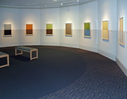
A survey of Alice Neel’s figurative paintings of family, friends, and lovers titled “People come First” at The Metropolitan Museum depicts striking portraits conveying an immediacy of line and color at first glance. Vibrant. Intimate. A longer look reveals an intense psychological relationship emerging between sitter and artist. Neel lays down just enough paint, as emotional evidence, to capture the tension and essence of her subjects. In Andy Warhol, Neel renders the face, torso, and shoes with recognizable clarity. She allows a few lines and background color to float within the substrate’s flatness. She is at her best when using less. Few subjects appear comfortable as if Neel is extracting more than the image. She demanded much from her sitters and herself, and for that, one critic called her a “collector of souls.”

Alice Neel, Andy Warhol, 1970, Whitney Museum of American Art

Julie Mehretu systematizes abstract paintings, drawings, and prints based on sociopolitical change, architecture, and literature. Two concurrent exhibitions – Whitney Museum of American Art and Gemini G.E.L. offer viewers much to take in. Her large-scale paintings at the Whitney present complex layers of information, articulating societal interests in incessant consumerism and connectivity. Dense accumulations of exacting linear drawing, geometric shapes, and expressive mark-making create a dichotomy of flat versus depth. The smaller exhibit at Gemini offers an intimate setting with prints created since 2008. Here Merhetu is at her best – a vision of energy and forces captured at its brightest moment on a flat surface.

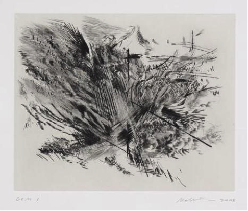
Julie Mehretu, Untitled, 2008, dry point, Private Collection

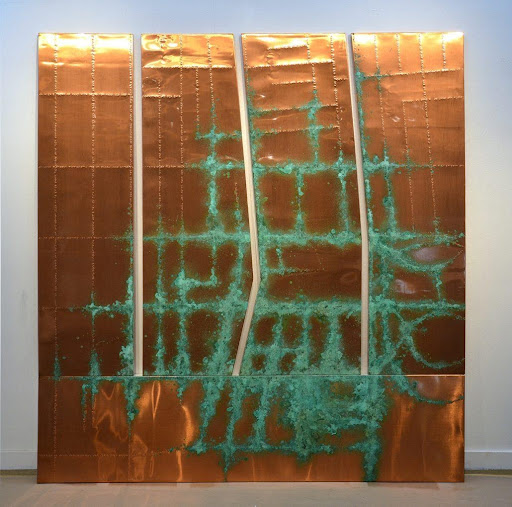
Lynda Benglis rounds out my evolutionary review with large cast bronze sculptures in “An Alphabet of Forms” at Pace Gallery. Benglis continues to inspire me as an artist. Not just that we both originate from Lake Charles, Louisiana, but most impressive and intriguing are her early poured latex works.  These fluid works, realized on floors, redefined painting in the 1960s. “An Alphabet of Forms” continues her interest in forms and material exploration as liquidity. Each “knot-like” naissance is a smaller clay sculpture which is then digitally enlarged. The sculptural forms simultaneously adhere to and evade gravity in their own sculptural entanglement.  They appear dropped from above and placed precisely. Viewers circumnavigate the sculptures in a causal dance associated with material, matter, and memory.

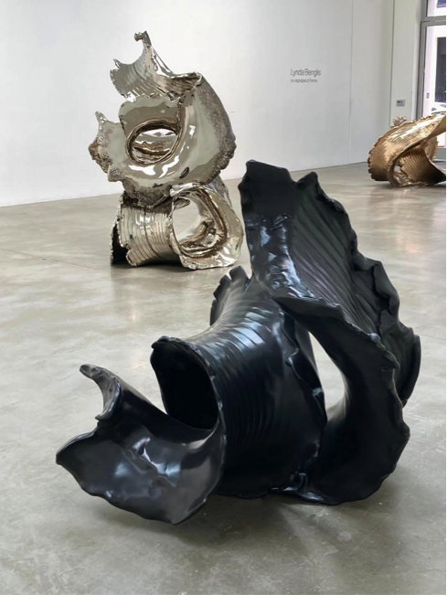
Gallery Installation, 2021, Pace Gallery, NYC

NYC Summer 2021, Part 1: “Cezanne Drawing” at Museum of Modern Art

Paul Cezanne told the artist Émile Bernard that art required two things – “the eye for the vision of nature and the brain for the logic of organized sensations.”

Plaster cupid, 1900-04, pencil & watercolor on paper, Museum of Fine Arts, Budapest

The current exhibition of “Cezanne Drawing” at MOMA provides an opportunity to experience the French artist from Aix-en-Provence and his organized sensations in over 250 pencil drawings and watercolor on paper. The quantity along with knowing these works on paper are light-sensitive and usually resigned to climate-controlled vaults is in itself a once-in-a-generation opportunity. 

Montaigne Saint Victoire, 1902-06, pencil & watercolor on paper, Tate Museum

Having seen very few of his watercolors, I made the pilgrimage to NYC to view the exhibition. Spread across nine galleries, the drawings and watercolors of figures, still-life and landscapes were almost overwhelming. While MOMA receives credit for producing a prodigious blockbuster exhibit at the quantitative level, Cezanne entices the viewer through a qualitative exercise – the value of slowing time to a near stop.

The jewels of the exhibition are the watercolors – radiant, light-filled veils of color. Cezanne’s organizing approach to what he saw was a slow exercise through attentive observation. He layered color on top of color, working slowly allowing each brushstroke to dry building form, creating space. Distinct color marks or patches can be discerned from one another elucidating his logical process. The even more elegant or interesting works on paper were the “unfinished” or “non finito” sheets. These particular works leave negative space or untouched areas of white to illustrate an object or area within the composition. A radical approach back then.

Skull on a table, 1885, pencil & watercolor on paper, Collection Jasper Johns

What Cezanne accomplishes in several watercolor works is an optical illusion of some white areas being whiter than others. Plaster cupid and Skull attain this effect seemingly by bordering the plaster form through his wavering pencil lines and minimal watercolor surrounding the object. There is no added white to the paper – this is the watercolor purist at his best.  His uncompromising eye knew the stopping point.

A grouping of 10 rock watercolors exhibited his aesthetic best as they shimmer with movement toward abstraction. Horizontal, vertical, and diagonal lines juxtapose with biomorphic shapes in Rocks near the cave above Chateau Noir. Here, Cezanne interrogates weighty geological formations into an airy and light-filled composition. Watercolor daubs of ochre, blues, and greens push and pull the paper’s surface toward and away from us in a dichotomy of flat and real space.  His influence in these works toward spatial intelligence leaves little doubt as to his title, “the father of modern art.”

Rocks near the caves above Chateau Noir, 1895-1901, pencil & watercolor on paper, Museum of Modern Art

I spent almost three hours gazing, analyzing, and relishing these works on paper and a few oil paintings, in two runs throughout the course of a single day. Having studied his work in graduate school over 30 years ago, his work upended my traditional way of seeing and thinking. 

Viewing this timeless work, was an opportunity to see through Cezanne’s eyes as a witness and intimate observer of the logic of his organized sensations. 

Cezanne Drawing, Museum of Modern Art, New York, June 6 – September 25, 2021

Braille: Night writing discovered in the Night

night, 2009, wood plugs, florescent paint, black lights carpet, 1/2x168x264 inches, Mars Hill University

Braille artists are inspired and influenced by a variety of sources – other artists, books, nature, travel, and the like. This may occur during moments or periods of doubt, a need for change in their own work, or an ongoing curiosity. Fifteen years ago, during a sleepless night, I was surfing the web with no purpose in mind other than to hopefully fall back asleep. It was then I came across a website on Braille and instantly recognized its geometric elements and relationship to the grid – two mainstays in my aesthetic practice. 

and if, between the two, hammered Braille on paper, 41x28x2 inches each, 2013, Mobile Museum of Art, Mobile, AL

Charles Barbier, an officer in Napoleon’s French army, developed a secret writing system called Ecriture nocturne (night writing) in the 1800s. His inspiration also came at night as he devised this after witnessing several soldiers killed when they used night lamps to read military messages. The enemy also saw the light, location and launched bombs onto the soldiers. Barbier based his system of 12-dot cells to allow military information to be read at night without light. 

Years later, a young boy named Louis Braille adopted and modified Barbier’s method into a 6-dot cell system. This enabled blind readers to touch each cell with a fingertip thus moving faster from cell to cell and acquiring information at a greater pace. Today, Braille is universally accepted for the blind.

the kindling point sustained, 2019, hammered Braille & patina on copper on wood panels, 102x96x1.5 inches. From the Collection National Federation of the Blind, Baltimore, MD.

Braille appeals to my ongoing use and fascination with methods, systems, and communication. Dot patterns populate my work as circles on 2D surfaces, as raised bas-relief dots on various surfaces, and as installations. 

The work intentionally challenges viewers to absorb information about an unfamiliar visual language synthesized within works of art.  That is, the participant must analyze the nature and relationships of signs within language and the source of knowledge within prescribed parameters. 

Concept proposal for Braille public art, 3D digital image – Julian Kotara 3D rendering

Then, supplied with this new data, information, and knowledge, I hope to instigate an inquiry into perception and information processing. Each work or project’s intent is for the viewer to closely observe their environment and determine how to process information based on social, economic, and cultural filters.

Review: “stop.moment” by Jerry Cullum, ARTS ATL

Barbe espagnole

Drawing: Works on Paper